Saturday, June 8, 2013

Turbonegro 2013 Tour Poster + 7" House of Vans Vinyl


This past February I received an email from Volcom Entertainment asking if I wanted to do some artwork for the upcoming Turbonegro spring tour. I didn't even have to think about this one. I get jazzed over any gig that involves a band or musician, especially when it's a band or musician I genuinely like. The original ask was for a tour poster and a 7" vinyl sleeve with artwork repurposed from the poster. These were the design directions, "...I asked them for some art direction and all I got was a couple stills from Gimme Shelter / Altamont concert movie... Like the part where one of the Hell’s Angels is freaking on acid or something and doing a weird dance and the image of Sonny Barger with the wolf head fur hat... I don’t really have a lot to build off of, so I’d say do your worst." 

This is the clip they were referring to, I think: 

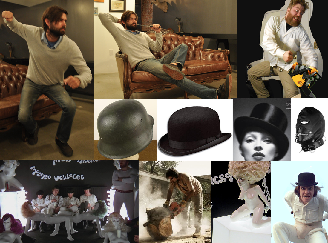
I decided to interpret the guy with the bad acid trip as a guy that is literally tearing himself apart. 

Using that as a starting point, I started on some rough, rough sketches. 

Followed by very loose color comps.

I wanted to incorporate the band members in a monstrous way, as if the viewer of the poster was experiencing the same acid trip as the biker that is ripping himself apart. The characters were illustrated with ink and then scanned into my computer where I colored them in Photoshop. 


Tony Sylvester a.k.a The Duke of Nothing


Knut Schreiner a.k.a. Euroboy


Thomas Seltzer a.k.a. Happy-Tom


Rune Grønn a.k.a. Rune Rebellion


Tommy Akerholdt a.k.a. Tommy Manboy

After my viewing of the band members I decided to add The Duke of Nothings tattoos to the woman  in the middle ground because his face was obstructed by her fox skin hat. A lot of these tattoo details got lost when I added the type towards the end.


When it came to the biker ripping himself apart, I referred to autopsy photos as well as photos of latex being pulled, Freddy Krueger, cheese stretching, etc. I also went ahead and just used myself as the model for the biker. 


With all the characters in place, this is how the finished poster looked without type.


With type.


I sent this off to Volcom and received a positive response, which is always a relief to an illustrator. With the poster out of the way, I repurposed the artwork for the Vans 7" vinyl giveaway, which you can read about here: http://www.vans.com/microsites/turbonegro/


The Vans micro site also used my artwork to promote the 7" vinyl giveaway.


With all this complete, I thought I was done with the project. I received an email that the Turbojugend wanted to print a limited run of t-shirts for the tour, which I was all for. At this point, the more the art is out there, the better. 

These shirts are actually available at the Turbojugend shop now. So pick one up along with some of the other killer merch they have there. 

This was a pretty smooth project over all. Everyone I worked with was great and I wouldn't mind working with any of them again. I went to the Turbonegro show at The El Rey in Los Angeles and was blown away by the performance. Seeing people wearing the shirt I designed was an added bonus. 

With that said, I'd like to thank Kurt from Volcom Entertainment, the people associated with the Vans 7" giveaway, Chuck "Destruction" Maple from the Turbojugend who was responsible for the shirt, and the fans for their positive reaction to the illustration. And of course, a BIG thanks to Turbonegro. 


(Yep, that's the band signing my merch. I swiped this photo from Volcom Entertainment.)


Thursday, June 6, 2013

The Smoking Gimp

This is a 22" X 28.5" acrylic painting on chipboard. I painted this for the Ted Perez + Associates head office located in Venice, CA. The gimp is part of a game where a contestant must put the cigarette out without the use of something like a squirt gun. More like a love gun, if ya catch my drift. As you can see, there is a target behind the gimps head, implying he has to hold the cigarette in front of his face. If you read the expression in the his eyes, the gimp is reluctant to take part. Can you blame him? Gives a new meaning to, "loads of fun."

On a side note, I was gonna purchase a gimp mask for reference photos, but they're more expensive than I thought. I ended up buying some pleather material and making one myself.


Monday, April 29, 2013

Dinosaur Jr Sketch + Video

A couple weeks ago I went down to Pomona, CA to see Dinosaur Jr. perform at The Glass House. I enjoyed the show very much and as a result decided to take a break from the projects I am currently working on to create a Dinosaur Jr. related sketch. It's not overly creative by any means as far as the concept goes. It's pretty much just J Mascis as a dinosaur. It was more or less an excuse to do something with real tools and real ink. The past few posters I've done have all been created digitally and I'd like to get back to doing stuff more traditionally. Supplies used: Kolinsky brushes, Deleter pen nib, Sumi ink and bleed proof white on 2-ply cold press illustration board. Actual Sketch took about 6 hours. I taped the progress on this one and edited the video along with the Dinosaur Jr. song "Let It Ride." (The video is under the sketch image below.)

Sunday, February 24, 2013

OFF! Fonda Theatre Gig Poster

This last January I had the privilege of illustrating the gig poster for OFF!'s February show at the Fonda Theatre in Hollywood. The show was cancelled due to health reasons. From what I've heard, it sounds like things are better and everyone's getting back to a fighting stamina, which is most important. For those that liked the poster and weren't able to get one at the show, the poster is for sale at the official OFF! store: http://www.merchlackey.com/off/ . The rest of this content will show the process for creating this poster.


When I saw this last December that OFF! was playing a show at the Fonda, I immediately tried to reach out to anyone I could think of to do the poster for the show. I'm a huge fan of this group and have seen them a few times in L.A. A few days after their record release show at the Whiskey last May I saw this photo taken by Cla$ick Clothing ( http://clasickclothing.com/ ).


So this was definitely a case of a fan trying to work with a band he liked and not just some dude trying to pad his portfolio.

I got the green light to go and started roughing out concepts. I decided to combine the members of OFF! with one of my favorite flicks, A Clockwork Orange. Seemed to be a good fit. Four band members, four droogs. With that creative direction, I created a pretty loose thumbnail sketch.


I knew I wanted to depict the guys in the Moloko Vellocet Bar, but I didn't want to just copy a scene from the movie and replace the actors heads with OFF!s heads. So I did some research of the Bar set along with the statues of the girls to get an angle not seen in the movie. After that, I did photo research along with taking my own photos for reference.


I used myself and a co-worker as models to get the poses I needed. I also did a ton of research on the costumes the droogs wore. The faces of the band members was most difficult because I did not have them at my disposal to pose for me. I did a lot of research on the group and basically Frankensteined their faces from a number of sources. 

With reference collected, I started working on the figures first. I used to sketch everything in my sketchbook, but I now prefer to sketch stuff on a computer. It's easier to edit, in my opinion. When sketching, I usually start with a light grey or red color to lay down basic lines to get the proportions and form in place. After that, I go over the loose sketch with a blue color to tighten up my marks and to add some of the details. 


  This is how my final sketch looked for this piece.


At this point I would usually go on to do my final line work traditionally with Pen and Ink on bristol board, but for the sake of time and for the ease of editing, I did my final line work in Photoshop too. So this was a 24" X 18" piece at 300 dpi. 

While working on the final line worked, I joked that the next piece would not have as many wrinkles or as much hair. Below are some detailed shots of the final line work.  


With line work out of the way, the color pallet was next. Originally I was gonna have the OFF! members in grey tones to contrast with a blood red background, but I feel like this look has been kind of played out at this point, so I decided to add colors to the whole piece. The typeface used for the copy is the Moloko typeface used in the movie. Not a "hippie font" as thought by a few fans. 


Final colors where added and the image was sent off to the band for the purpose of advertising the show. When the image debuted on the social networks, the positive reactions from the fans was pretty overwhelming. I was glad they responded to the image and was glad to have a few more people checking out my work. 


When all was said and done, there was one last request by one of the band members. They were curious to know if the original art was up for grabs. I explained that I created all the work digitally, however, I would be glad to re-create the line work in a traditional manner. So I used sumi inks and microns on some nice Italian paper to recreate the final line work.


In the end, this was an extreme pleasure for me. To quote OFF!, "I had a blast!" As noted earlier, this 24" X 18" poster is available at the OFF! store; http://www.merchlackey.com/off/