Ten Commandos are a group of killer musicians featuring Alain Johannes (Eleven, Queens of the Stone Age), Matt Cameron (Pearl Jam, Soundgarden), Ben Shepherd (Soundgarden, Hater), and Dimitri Coats (OFF!, Burning Brides). Their debut single Staring Down the Dust, which features vocals from Mark Lanegan (Screaming Trees, Gutter Twins) came out recently (10.9.15). The above image is the cover illustration I created for the debut single.
Personally, this was a dream gig to work on. I have a great deal of respect for all the musicians involved. In regard to Pearl Jam and Soundgarden, I've been listening to both groups since I was 11, so to work on something involving members from both of those bands was unimaginable.
A big thanks goes out to Dimitri Coats. I've had a great working relationship with him doing posters for OFF! and as a result, he suggested me to the group for this project.
Most of the stuff I've illustrated for bands at this point has had more of a comic book look and feel. For this particular project, I wanted to break away from that and illustrate something that wasn't as representational. Dimitri and I came to the conclusion that the viewer should stare at the art while listening to the music and come up with their own answers as to what the image represents.
Out of the dozen of concepts submitted this was the one that stuck. I refrain from showing the other concepts at this time because I plan on illustrating a couple of them to completion for my own collection. This concept was chosen because of it's ambiguity. From my point of view, there is a definitive answer as to what the image is, but I will hold back from revealing that. I've read a few comments from people describing their own interpretation of the image. I would say our goal was met given that everyone's interpretation has been different.
Sketches.


As usual, I start with extremely rough sketches in my sketchbook before I move to digital comps. When this concept was chosen I was asked to explore some other color options.


With a color option approved I went on to the final art. For the sake of time I illustrated this image digitally.
Work in progress shots.


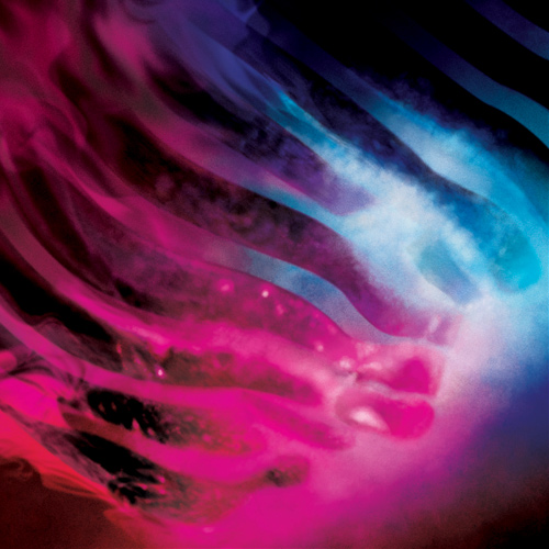


Final art with the bleed.

With the final image approved, art was sent over to Josh Graham for typography. He is also doing the layout for the Ten Commandos LP that comes out in November. His impressive portfolio of work can be viewed here: http://suspendedinlight.com
Final art with type.

If you're interested, you can find the song here: http://hyperurl.co/ah0qrl
Final note.

As I wrote earlier, I've been a fan of Pearl Jam since I was 11. I was in the Ten Club for a decade and sincerely consider listening to VS for the first time in my friend Ryan's basement back in October of '93 as a defining moment in my life. With all that in the open, I kind of had a holy shit moment when I woke up on the 9th and saw my illustration on Pearl Jam's homepage. So that's something...