Saturday, September 18, 2010

Laura Palmer or Sweet Young Thing Aint Sweet No More.


So... today I participated in my third "Masterpiece in a Day" held in the Fountain Square neighborhood of Indianapolis. Basically the way this works is, the competing artist shows up with their own supplies to create a piece of art in any medium they wish. The artist has between the times of 9:00 am and 4:00 pm to complete the work on the spot, then it's judged by a panel of fine adults followed by an orgy.

I have not done very well with any of my attempts at this competition. Believe me when I tell you technical skills are not a big deal with this contest. Most of the artists, and judges... apparently, lean towards more contemporary forward thinking art, which basically means if your image looks like and image, it sucks.

So this year I decided to mix 2-D and 3-D art. I created an image of Laura Palmer from the show "Twin Peaks" as she appeared in the pilot episode. (For those who don't know, her dead body is discovered wrapped in plastic floating in a body of water.) I illustrated Laura Palmer's face using the Oil Rub technique on illustration board. Then, I wrapped the illustration in plastic and stuck it in a water tank that I created. The image above is the finished product.

Bah! No luck. Still not forward enough.

Thursday, September 9, 2010

Ink Technique study


This is a study of Mark Lanegan created with the same technique as the previous blog entry. The procedure was fun to do, however, the likeness to Mark Lanegan is not really on the money. On that note, looks like it's back to painting for this chuuuuuuuuuuuuuuuump.

Thursday, September 2, 2010

Chuck Berry - ink layering technique


I tried out a new technique involving inks and a process similar to screen printing by which you layer your ink drawings over one another to create your tonal shifts.

I started out with a simple line drawing with a little, but not too much detail. The areas inked in black here represent the areas that would remain black for the final piece. To illustrate these lines I used black Sumi ink with a brush on Marker Paper.

After completion of the black layer, I taped a new piece of Marker Paper over my line drawing and got out my light table. With the black lines showing through, I inked in the areas where I wanted mid tones to show up on the final piece. This go around there is more of an emphasis on getting some of the details.
With the mid tones complete I added a third piece of Marker Paper to the top. This time, using the same technique, I concentrated on areas where I wanted the lighter tones to come into play. After all of the layers were inked, I scanned them in and started putting the composition together in Photoshop. I had all of the tones on different layers and set them up like so:
Bottom Layer-Blacks, Opacity 100, Layer Style Normal
Middle Layer- Mid Tones, Opacity 70, Layer Style Multiply
Top Later-Light Tones, Opacity 40, Layer Style Multiply

When all of the inks were set up on top of each other, this is what my image looked like:
After I had my tones scanned in, I started adding colors and other effects to get the final piece. Overall, kind of a fun process. A little time consuming, especially the scanning part. It's bad enough that my scanner is so small I have to put my drawings together like a puzzle anyways, but on top of that, making sure that three layers of drawings lined up. This was a first attempt with this technique, so I might try it again. I'm a little curious to see how it would work with a more illustrative composition including things like a background or some environment.

Thursday, August 19, 2010

10 years ago


On this day ten years ago I moved into the CCAD dorms as a freshman....... I should have gone into something like insurance.

Friday, August 13, 2010

Beck

I was curious to see how the oil wash mixed media technique would work with brush and ink.

Tuesday, August 10, 2010

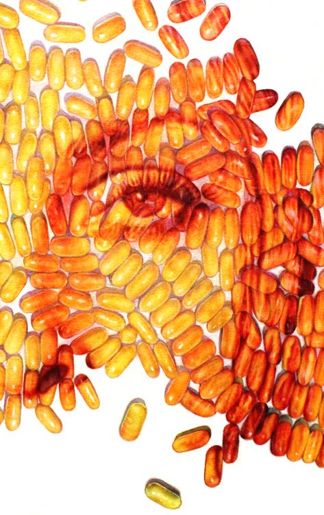
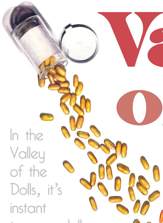
Valley of the Dolls Poster


This is a painting I did for the Cinematic Redux show (if you read Joel Jackson's blog you probably know about the show). However, my piece didn't make it to the opening because it was destroyed. I can honestly say that Valley of the Dolls is one of my favorite films and I enjoy reciting lines of dialogue from this film with my sister, especially if my brother-in-law is in the same room(he has not seen the movie, so he just looks at us with an incredulous gaze most times). The image for the poster with the pills and Sharon Tate's eyes was created with acrylics, oils, gouache and colored pencils on illustration board. I really under estimated the time it would take to paint every one of those pills on a large piece of board... it took for fucking ever. The text was then brought in with the computer, but the rest is 100% traditional. I found the process of creating this image extremely tedious and boring. In the end, I thought the image was descent on a technical level, but kind of lacking on a conceptual level. It more or less became an exercise of technique as apposed to something visually interesting and I'm kind of tired of creating pieces like that. The past couple of years I have taken a huge interest in creating pieces with brush and ink and actually enjoy that much better... so I will probably be going more that route from now on. So here is the final piece with detail and progress shots.